Uber brand

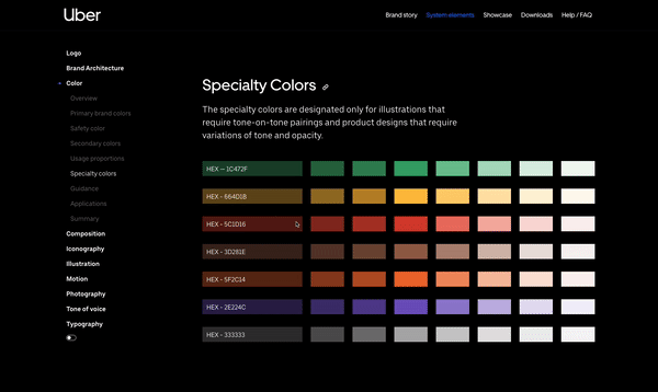
Uber launched new brand guidelines in late 2018 and asked HAUS to create a responsive site that would present their unique identity to the world, showcase the work designed around the world, and at the same time display guidelines and provide access to assets.
Uber Brand construction guidelines page inside a white desktop laptop.

Project summary

Goals

Showcase Uber’s new brand guidelines so designers can create their best work.

Tools

Sketch, Invision, Zeplin, Contentful

Role

UX Designer
Leo Cebrowski - Art Director
Arturo Wibawa - UI Designer

The challenge

Uber released new design guidelines that only existed in a presentation/PDF. Uber asked HAUS to create a responsive website so that designers worldwide working for Uber could access and obtain the most up-to-date designs and rules. They also wanted to show off designers’ best work using this new system to inspire and showcase the system’s flexibility.

Uber Brand construction guidelines page inside a white desktop laptop.

Competitive analysis

I began researching other primary brand guideline resources to learn more about their best practices, unique interactions, and significant themes for information architecture.

Airbnb Cereal guidelines in a white laptop mockup
Airbnb Cereal

I became utterly smitten with Airbnb’s Cereal guidelines and the story behind the brand. They definitely had the fun factor we were looking for with their interactive typography examples.

Google Material Design guidelines in a white laptop mockup
Material Design

I have a huge admiration for Google’s Material Design guidelines, especially their information architecture. I made the decision to adapt their structure into my approach. My decision stemmed from my own admiration and because these users would be familiar with this site, and I wanted to match their expectations.

Twitter Brand Resources in a white laptop mockup
Twitter

Twitter’s Brand Resources had a precise, to-the-point feel that felt very accessible to the general public and internally too. We thought it had great jumping-off points from a homepage that helped users find what they need quickly. Very skimmable.

Dropbox design guidelines in a white laptop mockup
Dropbox

Dropbox was less robust from a content perspective but made excellent use of negative space and extensive imagery to keep the user's attention. They also had great "don't" examples.

Findings from user interviews

During the research phase, I conducted 14 user interviews with designers, design managers, external contract designers, and producers at Uber to better understand their goals and pain points.

You know the drill. We have to talk to the users to make sure we’re designing the right thing, or what is the point?

Sorry, preaching to the choir here. Back to the case study…

01 Keep it organized

Sections should be clearly labeled, and users should be able to jump to relevant sections with one click.

02 Speak to me

Serve as a single place of global brand unity but also accommodate regional guidelines.

03 Let me find it quickly

Everything should have a deep link that can be shared. Downloads need to be very obvious.

04 Pretty never hurts

This website should be the best of the best in how it implements these guidelines.

05 Evoke brand values

This is a new face and voice at Uber. The site should be an expression of the new guidelines in every way.

06 Keep me interested

No blah. We want designers to feel excited to visit the site and have fun interactions to keep them interested.

User personas

After interviewing various stakeholders and users at Uber and their external design partners, our team completed four different personas that would be our design guideline (pun very much intended) for our future designs.

Note: User Personas created by Stephen Prescott, Director of UX at HAUS.
Uber Brand User Persona of a Uber Brand Designer
Uber Brand User Persona of a Uber Brand Producer
Uber Brand User Persona of a Uber EMEA Designer
Uber Brand User Persona of an External Partner

The biggest takeaway

This isn’t just a marketing site that will sunset in a few months after people learn the new design system; this is a living, breathing internal tool used worldwide. All of these users exist in the same ecosystem, and making improvements for one of them, ultimately helps the others. 

Designers at Uber are spending a lot of time in a variety of places finding the assets and guidelines they need to create their best work.

How might we create a single source of truth to save designers & managers valuable time and energy when creating and approving designs?

Simplifying main navigation information architecture

First approach

When we began thinking about the site's information architecture, we believed the system elements (logo, composition, illustration…) should be front and center in the main navigation. While the other aspects of the brief would either be represented in content blocks or secondary to the system elements.

Uber brand version 1 site map
Uber Brand Site Plan Version 1
Iterate, iterate, iterate

You might have guessed it, but once we put it all down and started sketching what this monster main navigation would look like, we quickly realized that there were way too many items in the main navigation, and potentially overwhelming users before they even got started.


How can we make this site map more digestible to users at first glance?

uber brand site map changes from version 1 to version 2.
Changing business goals

In addition to our own changes, the client also had some direction pivots and wanted to surface the brand story more prominently on the site. We were also unsure if Uber Eats and other Sub-brands of Uber would need their own pages. So we decided to put all the system element sections into one page to open up some navigation real estate if we needed it later in the project.

This also meant we would need faceted navigation on the System Elements page to increase user efficiency, so they didn't need to scroll all day long to find the section there were looking for.

Uber brand site map final
Uber Brand Site Plan Version 2

Design guidelines to design systems

One of my biggest challenges was turning the 140-page slide deck of guidelines into a design system of content blocks. I started by conducting a visual audit of the deck and categorizing the slides based on their layouts to understand how many different types of content blocks we needed to design. Is this a full-bleed block? Is it a 3-up? Our goal was to leave as few outliers as possible to limit the number of one-off blocks that our team would need to build.

Full Bleed Content Block - Uber Slide Deck
2-Up Content Block - Uber Slide Deck

Creating interaction points

There were still outlier blocks that just didn’t match any other traditional layouts. Working with our UI team, we decided these few outlier pieces of content would need to be reimagined for web purposes or create interactive blocks that use simple tricks like clicks or hovers to make them come to life while being functional.

Uber Brand Slide: Partnership Lockups
Arrow icon
Website Interaction: Partnership Lockups
Uber Brand Slide: Specialty Colors
Arrow icon
Website Interaction: Specialty Colors

Developing the content matrix

Turning a 140-page slide deck into something our team could import into a CMS was no easy task. After determining what content blocks would be used, I created a content matrix for our development & production team to implement the actual content into our new system.

Each entry required

- Section Name (ie. Color, Logo)
- Slug Path (ie. /Clear space, /Placement)
- Module Type (ie. Full Bleed, 2 Up)
- Guideline Page Reference Number (ie. Pg. 100)
- Copy & Image Elements (ie. Headline, Body Copy, 2 Images)

Image of content matrix database.
Content Matrix Screenshot

But what about mobile?

You might be saying, “Why am I not seeing any mobile designs?”

We decided to focus most of our efforts on desktop designs because 98% of the users visiting this site are visiting from a desktop. These are designers coming to download assets for their projects using their laptops or desktop machines to access the site. However, we can’t not have mobile designs!

The site was built on a responsive grid, so it was easy to transfer to mobile screens; however, we ran into a lot of trouble about what to do with the faceted navigation on the System Elements page. We opted for a dropdown sub-navigation that users could navigate independently from the main navigation. This idea was lovingly adapted from Material Guideline’s similar dropdown sub-navigation.

user flow of five mobile screens showing the navigation on mobile devices.
User Flow on Mobile Device

Filtering downloadable assets

Finding and filtering assets is a significant use case for this site. Not just finding the asset but also knowing that it’s the most up-to-date asset available. There could be hundreds of potential files a designer could download, so I added pagination to narrow down results into manageable chunks and improve load times. I also worked with our development team to create user stories in Jira of how the Downloads filter would function.

Three wireframes from low to high fidelity of the filtering page with annotations.
Iterations of the Downloads Page from Low Fidelity to High Fidelity

Final designs

Hero image of uber Brand homepage.
Nine screenshots of the uber brand site and the various pages within the site.
Screenshot of the composition page on the uber brand site with the column grid turned on and tooltip shown.